
"Frequent errors in data started causing trust issues for our long term partner in our system. We had to come up with a way to proactively monitor and fix all the API transaction issues. "

Initial Research
"We started by trying to understand the value this tool would bring in"
Even though we hypothesized that the problem as real and required action, we had to validate this.
So we decided to start the project by interviewing our internal support team.
We also tried to understand their current process, how they were handling support tickets regarding the transaction errors and how beneficial it would be for them if we introduced a tool like this.
It came to our notice currently support teams function reactively than proactively.
Currently when there is an error happening in a transaction, users report it in a later stage, when they notice and our support team fixes it.
There was no way for them to monitor all the API Transactions that happened and the status of them.
Using card sorting to simplify the data to be shown

One key insight was that they were more concerned about transactions that didn't go through vs the ones that did.
We listed out different errors that could happen and how probable it was to happen.
We also figured out the severity and how they handled each of these type of errors.
We checked what was the data they wanted to see in each of these scenarios and what realated actions could be automated from the systems side.
Next we did a card sorting excercise with the data they mentioned and tried to figure out if all of them were essential to be viewed as well as in what order.
"Once we were clear of the requirements we started exploring ideas for it"
We reworked the expected userflow to focus on the errors to make the process more proactive than reactive and discussed it with the users.
For a flow like that we figured out a dashboard approach would be better.But at the same time we should be providing user capability to search and reach a particular transaction easily.
Reworked dashboard wireframe

Our solution was to incorperate both in the dashboard.
There would be a summary section which would give a top level view of the transactions.
Then there would be all the transactions listed below which could be searched or filtered upon so that users could easily drill down to particular transactions easily.
We also created secondary flows and edge cases based on these.
Getting to Solution
We presented our findings to the key stakeholders and users and got inputs.
Then we elaborated the flows and came up with the base UX design as wireframes.
After that we user tested the wireframes using an unmoderated study with 5 users in userlytics to figure out the bottlenecks in the flow

Next we followed it up with the visual design.
For heavy data application it is better to keep the design simple and minimal so that it doesn't overload the user.
We already have a design system - Gravity 2.0 in place which abides by that principle. So styling was already defined.
The UI was then prototyped
To validate the designs and the prototype was thoroughly tested with internal and external users in a moderated manner.
Based on the testing there were minor amends done like fixing some columns in the table of transactions, adding more filtering options etc.
Finallly the designs were shipped for development. The implementation once done was again checked by us.
We also followed up with users and collected their feedback, which were generally positive except for some minor hiccups in edge cases.


Drastically reduced failed transactions. The tool helped in giving prompt response from customer support teams.
Better understanding of status of all integration requests were provided to vendors.
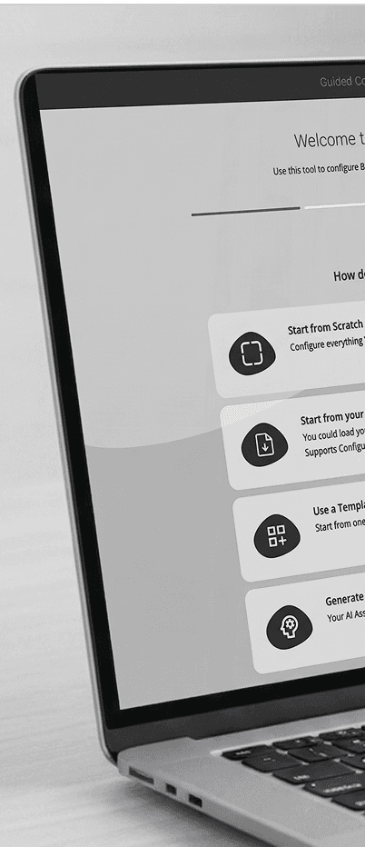
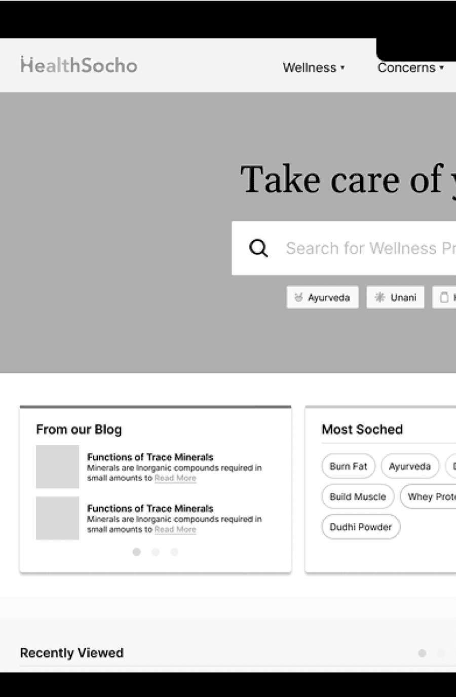
How I improved Conversion rate
@ Healthsocho
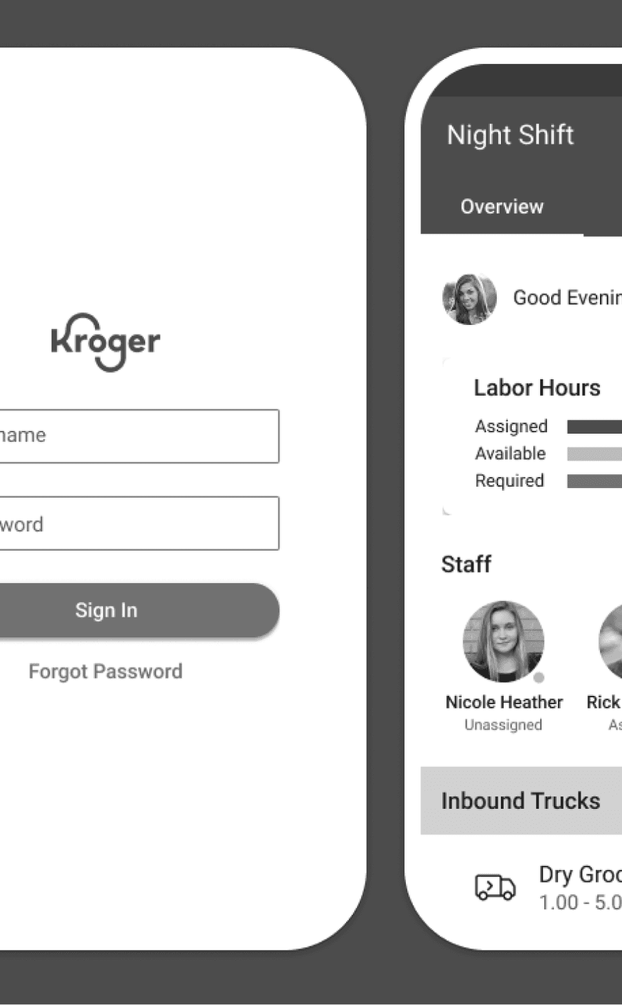
How I simplified staff management @ Kroger
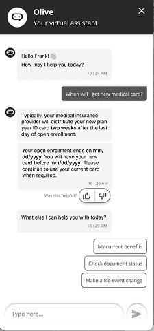
How we reduced customer support requests using ai
@ plansource